Mobile reporting, Dell
Mobile reporting, Dell
Sometimes sales makers need data on demand, quickly, wherever they are. Here's what that can look like.

a sales dashboard for everyone
This was my first project for the IT Innovation Team: a mobile dashboard for the ESG (Enterprise Solutions Group). The goal was to provide a prototype that demonstrated options and best practices; could be used in further design and development; and could help define requirements for data visualization vendors, should Dell decide not to develop in-house.
people and flow
There were fourteen defined roles for the desired software, which I refined down to three personas that met the different permission, device, and feature requirements. (Full disclosure: the images below were generated by Leonardo AI, as I do not have the original persona slides.)
-

Marina, General Manager (GM)
Executive-level and driven, Marina sees sales as the team that keeps the company afloat. She is interested in sales analysis by factors such as region and product line, as well as the performance of the multiple teams within her purview. -

Jim, Outside Regional Sales Director (ORSD)
Jim manages customer-facing account executives at a variety of levels, and reports to an executive director who reports to Marina. He is focused on customer, product, and team member sales performance. -

Sheryl, Services Account Executive (SAE)
Sheryl's focus is large enterprise sales, usually of custom, complex services. She is often onsite with customers and when wifi fails would like a usable, useful option on her phone. She reports to Jim.
While I can't share the actual spreadsheet here due to NDA requirements, I can share that Dell was the first place I began to systematically capture the same data for all personas and roles. This included but was not limited to:
- Goals, tasks, and pain points.
- Devices used: laptop, tablet, phone, QR scanner, something else?
- OS and browser requirements.
- Environmental notes: does it vary? Is it busy and changeful, or quiet?
- VALS (value, attitude, lifestyle), a personality type approach extracted from conversation.
- Education level.
- Who do they support? Who do they report to?
- How do they use the web app/SaaS in question? How often? How long are sessions?
- Do they need to speak multiple languages?
- Any particular HCI notes.
After acquiring these, I looked for the minimum number of roles that covered all the various data. With that in hand, I began to arrange post-its (I would probably use Figma now) into clumps of UI and process flow, differentiated by permissions, etc. Once I had that, it was time to wire.
prototype and desktop view
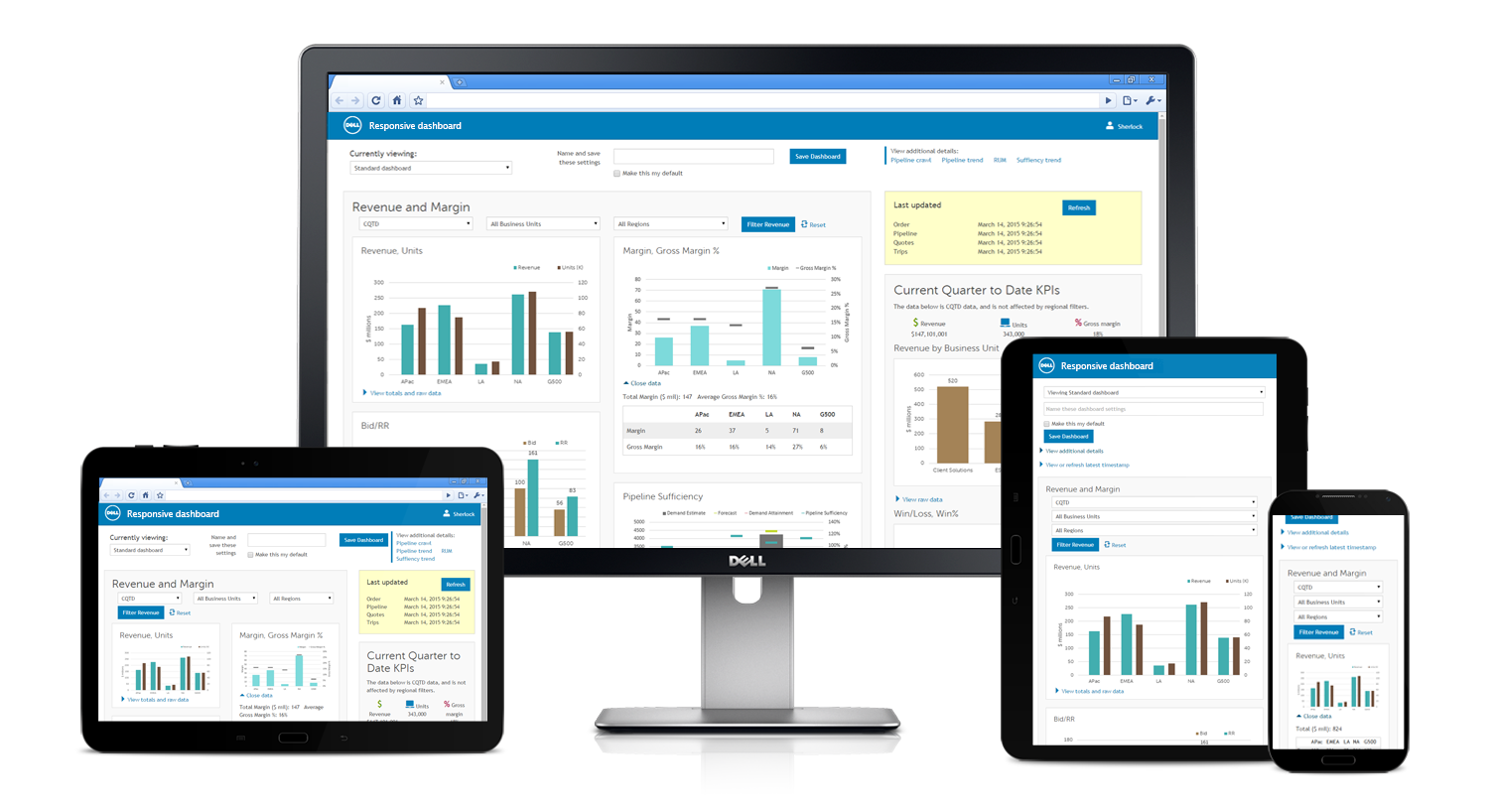
I decided to make one of my "live wire" prototypes in Bootstrap, using Dell brand styles from in-house framework Sherpa. This approach allowed designers to demonstrate concepts, innovations, and interactions quickly and test them, before diving into more detailed visual styling. (Code also empowers RITE usability testing, which I love.) I no longer have the prototype, but I do have screen shots and one photoshopped image (above) created from the screen shots.
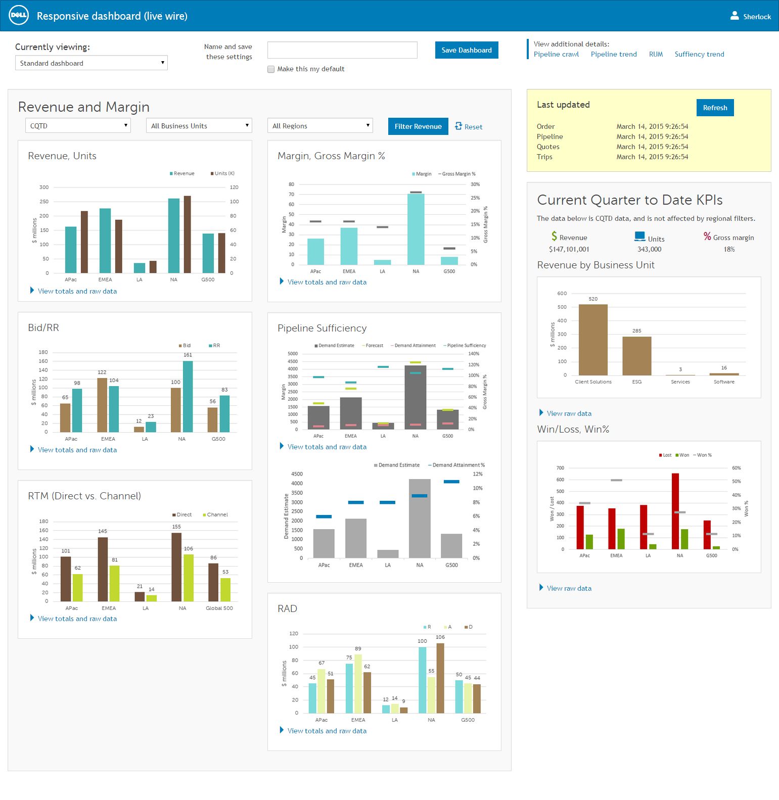
The charts are not the final version, but they follow my self-developed dashboard, color, and data viz accessibility guidelines, later adopted by Dell Brand for all Dell data visualization.
Worth noticing:
- Proximity and borders/background colors group related charts to reduce cognitive load.
- Apart from links and various calls to action, the only non-gray colors are in the charts. Keeping colors in the charts reduces distraction.
- Each chart has a link to an on-demand table version of the content, for users who prefer tables to visual content.
- Viewers can filter data by time frame, region, and business unit. They can also save filter settings and choose to make a specific filter setting their default.
- There were multiple data sources, and the time stamp recency reflected that. Typically they were in sync, but not always.
- "Reset" allows a quick return to your default state.

Click on image to see it full-size, in a new tab.
tablet, small desktop view
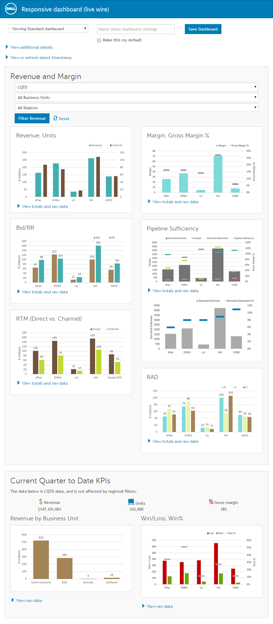
Worth noticing:
- Grouping is preserved in mobile view.
- Details such as timestamp are hidden behind expand/collapse links.
- No Feature Left Behind: If you can see it on a desktop, you should be able to access it on your phone. Mobile dashboards are useless without all the data and features, though interactions may change.

Click on image to see it full-size, in a new tab.
vertical phone view
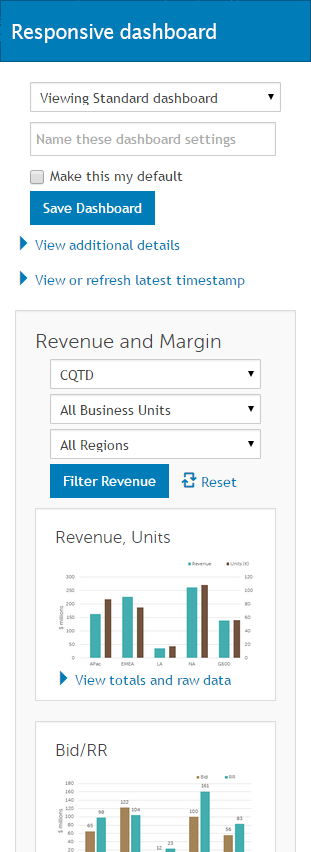
Lots of scrolling—but then, there's lots of data. This is cropped; click for the entire vertical scroll.

Click on image to see the full scroll, in a new tab.
what, where, & when
Sr. UX architect
Dell
Richardson, Texas
2013–2016
personas
executives, sales makers, general managers, sales account executives—anyone requiring sales-related data on demand
tools
HTML, CSS, dimple/D3 JavaScript, Sherpa (in-house JS framework)
keywords
data visualization, dashboard, mobile, responsive, user testing, interaction design, prototype, accessibility, usability
[Alex] relies on her wealth of experience and knowledge to provide well thought through design solutions. When she does not know something, she learns it; quickly. She does not sit idle and is always learning which makes her a great advocate for a better user experience. If you have a complex UX/UI issue that needs to be solved Alex would be a great choice.
Jim Machajewski, Director of UX Design, Dell